Brand Identity 2026
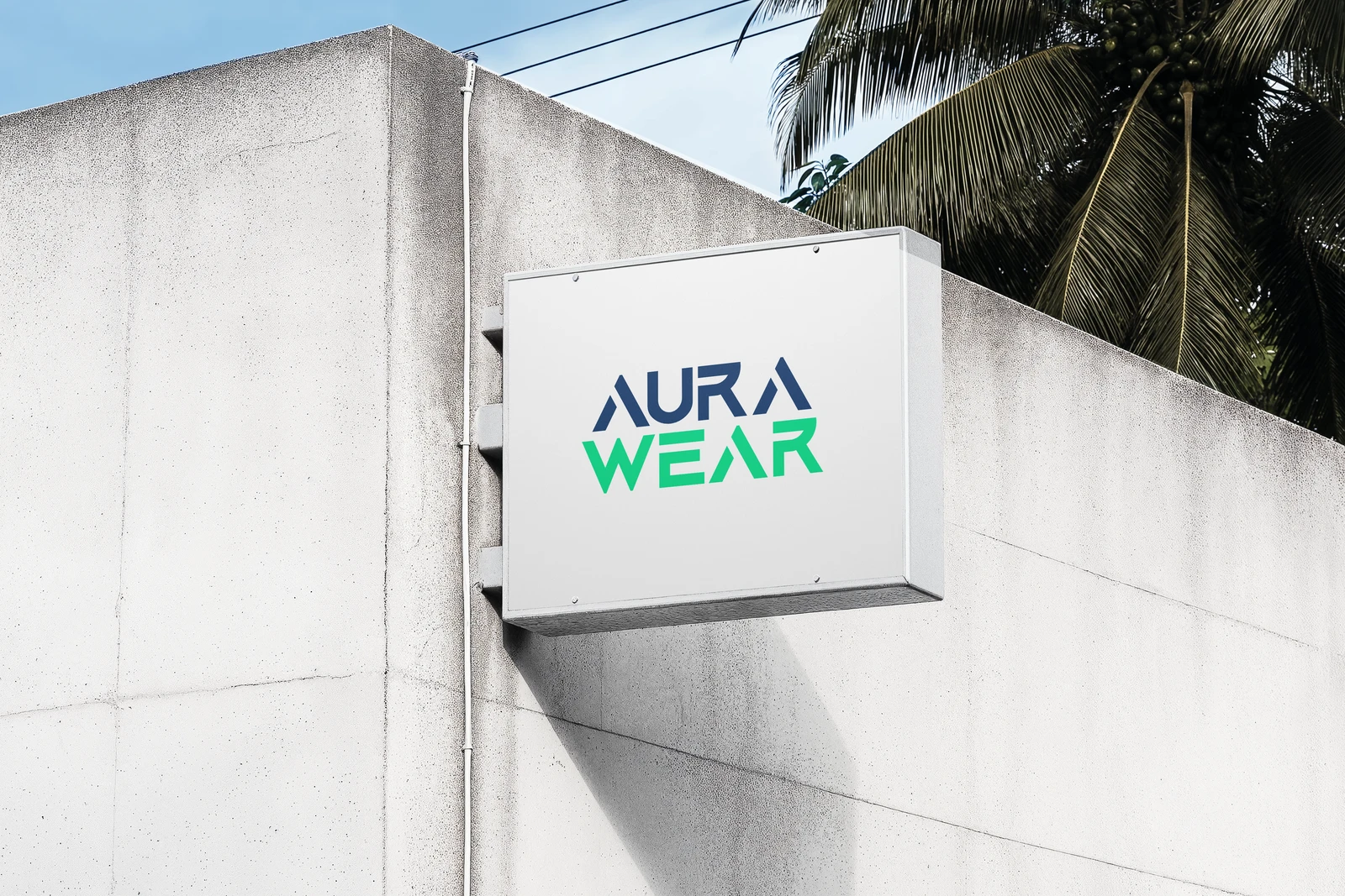
Aura Wear
AuraWear is a modern wearable technology brand that blends innovation with everyday style.
- Role
- Brand Identity
- Tools
- Illustrator
- Timeline
- 5 Week
THE CONTEXT
Fashion meets functionality
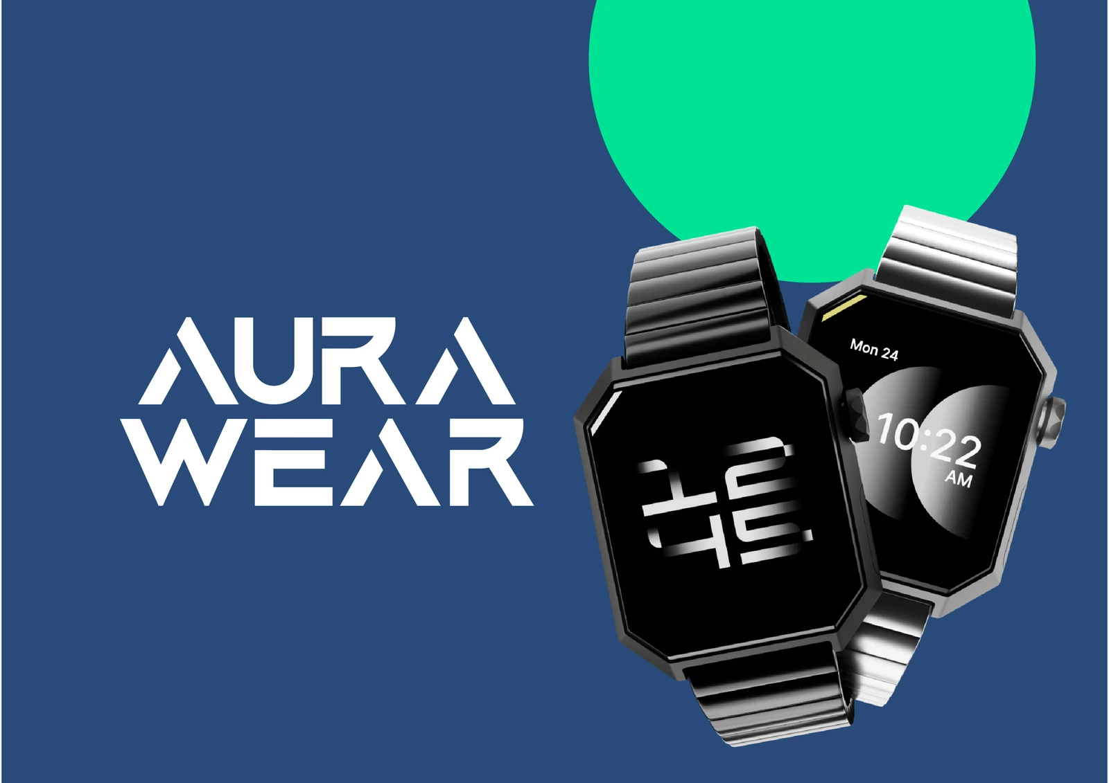
Today's wearables are more than just gadgets, they're a part of who you are. Aurawear brings together advanced technology and modern design, creating wearables that look as good as they perform.
 Smart Watches
Stay in sync, inside and out.
 Fitness Trackers
Track progress, build better habits.
 Smart Rings
Smarter tech. Sleeker form.
Research
Studied AuraWear's audience, industry and positioning to define a premium yet approachable direction for wearable technology.
- Wearable technology
- Tech-savvy professionals
- Style-conscious users
- Innovation & functionality

Direction
Explored a visual direction that could balance technology, fashion and simplicity without feeling overly complex.
- Technology & fashion
- Premium & contemporary
- Simplicity & elegance
- Dynamic visual language

System
Built a versatile identity designed to work across wearables, packaging and digital experiences.
- Logo construction
- Brand mark
- Typography
- Colour system

Application
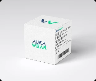
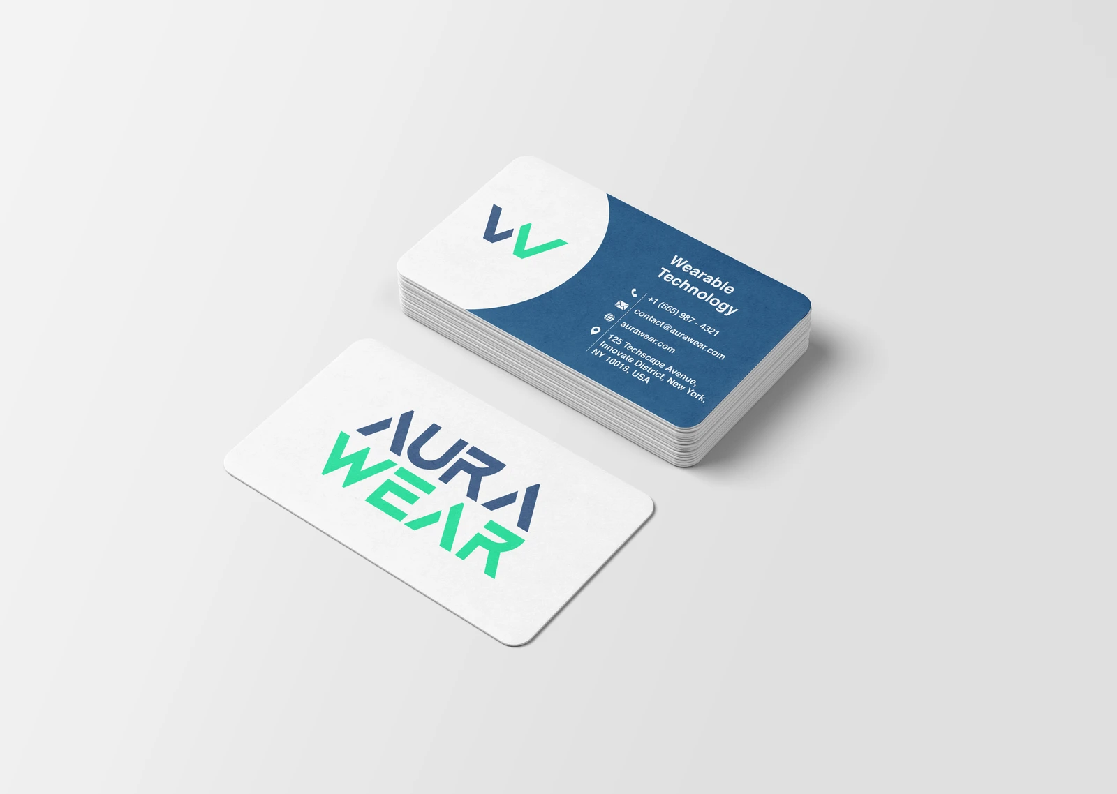
Tested the identity across the touchpoints where AuraWear would meet its audience, from products to digital platforms.
- Smartwatch & smart ring
- Packaging
- Digital platforms
- Brand applications

The Mark
A symbol built for technology and style
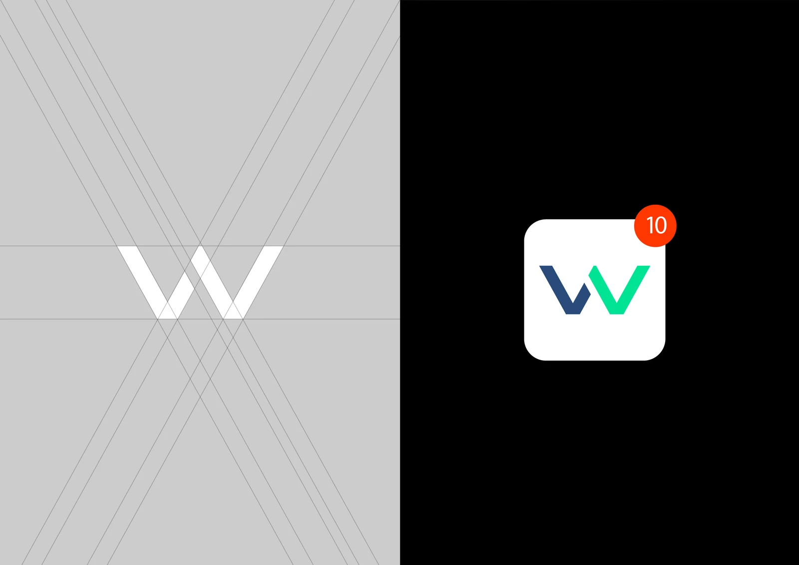
The mark distills AuraWear into a simple geometric form that feels contemporary, dynamic and versatile. Its clean construction gives it the precision of wearable technology while keeping enough character to work as a fashion-forward brand mark.
- Grid
- Built from simple geometric forms to create a clean, recognisable symbol that can stand independently from the wordmark.
- Weight
- The mark uses a balanced visual weight to complement the bold AuraWear wordmark without overpowering it.
- Versatility
- Designed to remain recognisable across small digital spaces, wearable surfaces and larger brand applications.

Color Palette
Click a colour to open it
Type
Aquire, from Light to Bold
Fashion meets functionality.
Font: Aquire, self-hosted in Light, Regular and Bold. Only these three weights exist, so the slider snaps between them rather than morphing smoothly — Aquire isn't a variable font.
The Complete Visual Identity