Brand Identity 2026
Thresca
AI products default to cold, technical identities. The challenge with Thresca was the opposite: make something that felt precise and intelligent without feeling like software. The result is a dark-first identity built around a structured mark, a restrained purple accent, and a voice that never says “leverages AI.”
- Role
- Brand Identity
- Tools
- Illustrator
- Timeline
- 5 Weeks
The context
Meetings are valuable. But the follow-up isn't.
Most meeting AI tools join the call, which can feel intrusive or uncomfortable. Thresca was built as a quieter alternative: you paste the transcript, it extracts what matters, and turns it into structured notes, action items and a follow-up email. No bot joins your call.
Meeting Summary
Every decision, in one paragraph.
Action Items
Owner, deadline and priority : extracted.
Follow-up Email
Ready to send before the call ends.
CRM Notes
Paste directly into HubSpot or Salesforce.
Research
Explored how meeting information could be captured, structured and revisited without requiring an AI to join the conversation.
- Existing AI meeting tools
- Meeting transcripts & information
- Notes, decisions & action items
- User privacy & comfort

Direction
Defined a product direction that felt quiet, focused and useful — without adding another participant to the meeting.
- Passive meeting capture
- Simplicity & speed
- AI without interruption
- Clear information hierarchy

System
Built Thresca around a visual identity that feels intelligent, modern and approachable — without becoming overly technical.
- Logo construction
- Logo variants
- Typography
- Colour system

Application
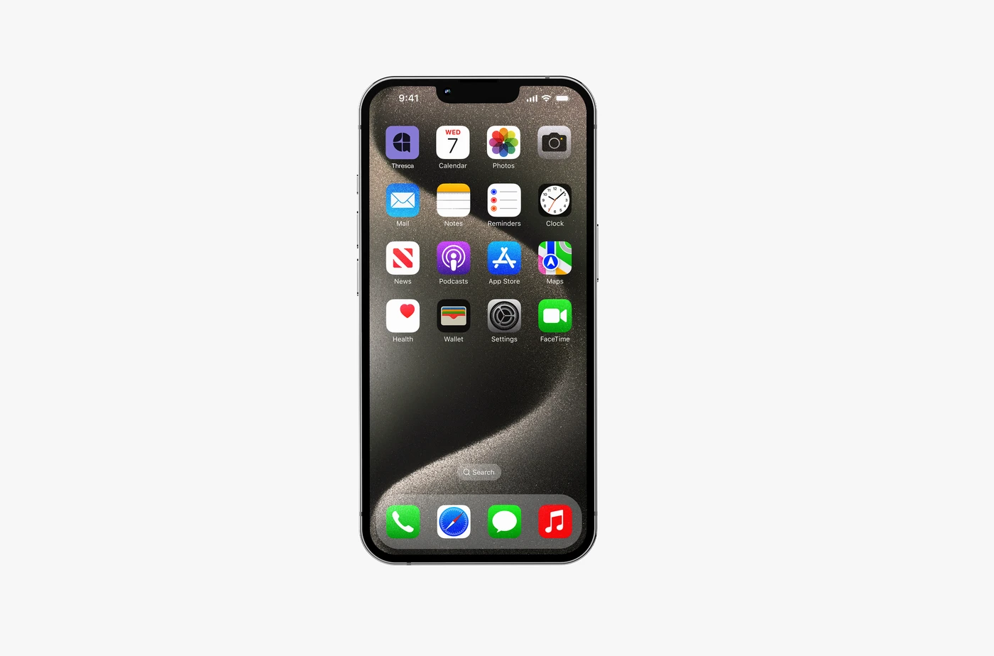
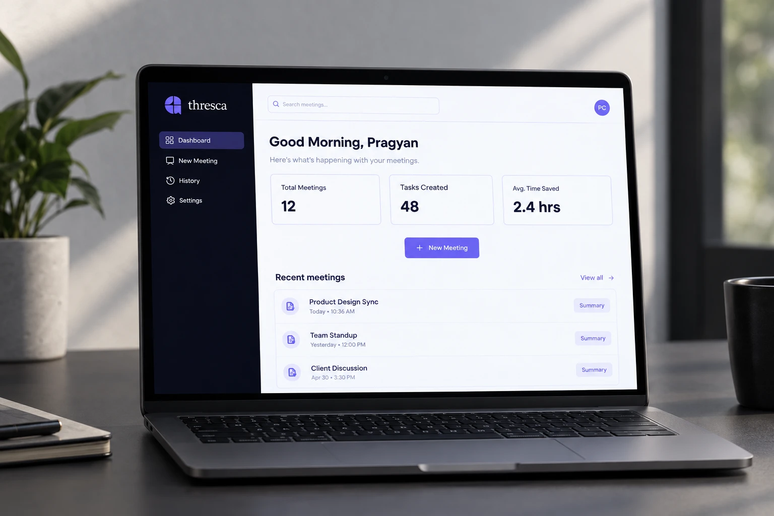
Applied the identity to the product experience, creating a focused interface for turning meeting input into structured, actionable information.
- Dashboard
- New Meeting
- AI output
- Task tracking

The Mark
Structured on a grid, not by eye
The Thresca mark is built on a four-quadrant grid — two vertical and two horizontal axes intersecting at a single centre point. Each quadrant holds one element: the result is a mark that reads as organised, precise and deliberate.
- Grid
- Built on a four-quadrant grid. All four elements are anchored to the same centre point and spaced from it proportionally.
- Weight
- Visual mass balanced across all four quadrants so no single element reads as heavier than the others. Sits at equal weight with the wordmark at the standard lockup scale.
- Minimum size
- 20px. The four-quadrant structure holds legibility at favicon scale before the internal spacing collapses.

Type & Color Palette
A calm, clear and Approachable system
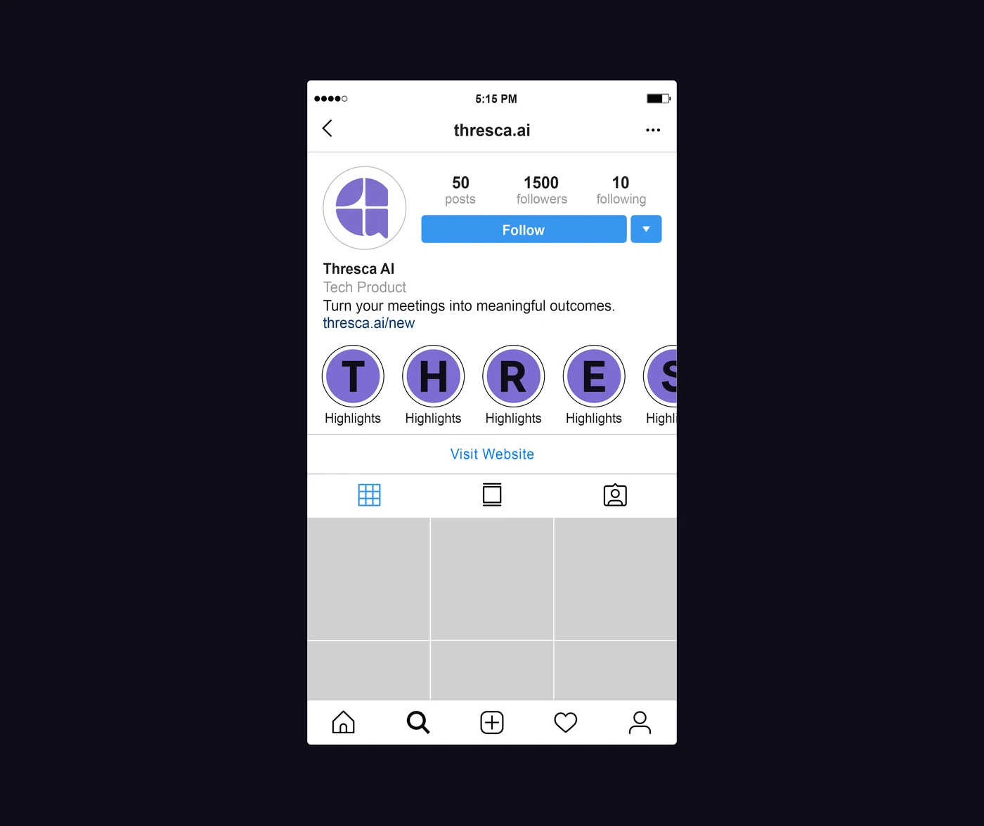
Turn your meetings into meaningful outcomes.
The Complete Visual Identity